Emerging-markets Script Add On ($ Set Up, $0 Additional Monthly)
Also Known As: RWD, grid design, fluid web design
Responsive web design or (RWD) is specific techniques and code that allows a website to display differently depending upon what type of device it is being viewed on without using a totally different set of html instructions. In other words, a responsive website will generally look the same no matter what device is used to view it.Google Analytics allows you to track visits from various devices. According to Thrive Marketing more than 40% of daily users make purchases on the Internet via smartphones. The conclusion is obvious: time spent at a computer, yields to the time spent with a mobile device. So, make sure the design Your-Web-Guys use is sure to fit any device that's on the market today!
>>> Update 2/10/2014 <<<
Now every website we build is responsive. This is no longer an add on or additional fee. If we build your website it will be responsive because it is no longer an option. Google will be updating their algorithm to remove websites that are not mobile friendly from the results on mobile devices. When this happens we want our clients to be ready so from now on, every website we build will have a responsive layout and be mobile friendly
This item can be added to your website for no additional charge if you have any of the following items or packages already.

Update!
Now you can get your website built with no start up costs
Your-Web-Guys have done it again! With our industry leading $0 initial setup fee program! With approved credit, we will now build you a state of the art website using our standard platform or our Ecommerce Platform for no setup fee or design fee. Just a simple monthly charge starting at $200 per month. Click the button below to get all the details and to make sure this program, and we are right for your project.Click here to schedule instantly
Responsive Web Design Overview
Some of the benefits of having a Responsive Web Design on your website include:- Advantages of Responsive Web Design according to Google
- Google recommends webmasters follow the industry best practice of using responsive web design, namely serving the same HTML for all devices and using only CSS media queries to decide the rendering on each device.
- it keeps your desktop and mobile content on a single URL, which is easier for your users to interact with, share, and link to and for Google's algorithms to assign the indexing properties to your content.
- Google can discover your content more efficiently as we wouldn't need to crawl a page with the different Googlebot user agents to retrieve and index all the content.
- Fluid GridsFluid grids refer to fluid designs where the grid units resize according to screen size. It is about defining your own parameters for various objects in code like columns, spacing and containers. Size and spacing are the two main components to focus on in creating your flexible grid system. Whether you're using a premade grid system or creating a custom solution, use percentages (or ems) rather than pixels as your units of measurement.
- Flexible ImagesFlexible images move and scale with the flexible grid. This means scaling down according to the HTML attributes of height and width for more text content on smaller devices. The other way to scale images is cropping them with the help of CSS overflow property. The containers around images will shift to fit new display environments. One more way is loading different image versions to a server and displaying the proper size version dynamically depending on the used device.
- CSS Media QueriesMedia queries allow designers to build multiple layouts using the same HTML documents by selectively serving stylesheets based on the user agent's features, such as the browser window's size, orientation, screen resolution, color. They act as conditional comments that are able to indicate the used device and serve up different code for different device attributes, in other words target different screen resolutions with different styles.
- Screen ResolutionsCommon resolutions include the 320px portrait width and 480px landscape width of smartphones, 768px portrait width and 1024px landscape width of tablets (and typical netbook resolutions) as well as various desktop monitor resolutions. A layout that only caters for preset resolutions is often referred to as being adaptive, whereas a truly responsive layout will be built using ems or percentages, allowing an infinite level of scaling.
Responsive Web Design Features Include:
(but are not limited to)- Available Layout Options:
- desktop 980px layout
- tablet 768px layout
- smartphone horizontal (landscape) 480px layout
- smartphone vertical (portrait) 320px layout
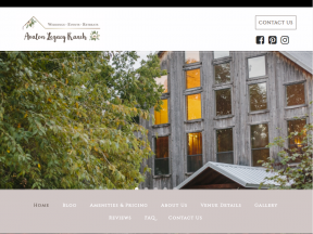
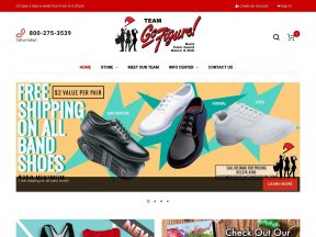
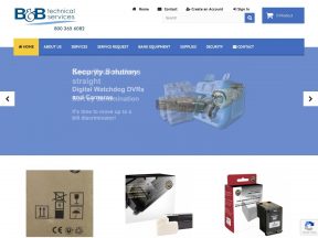
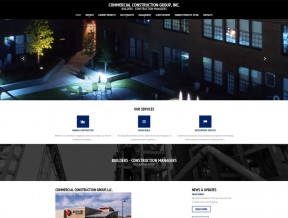
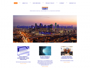
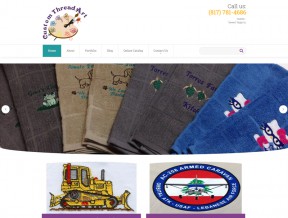
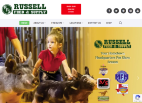
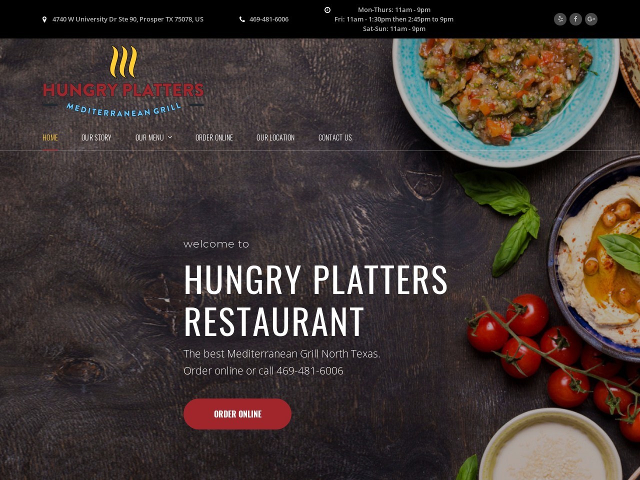
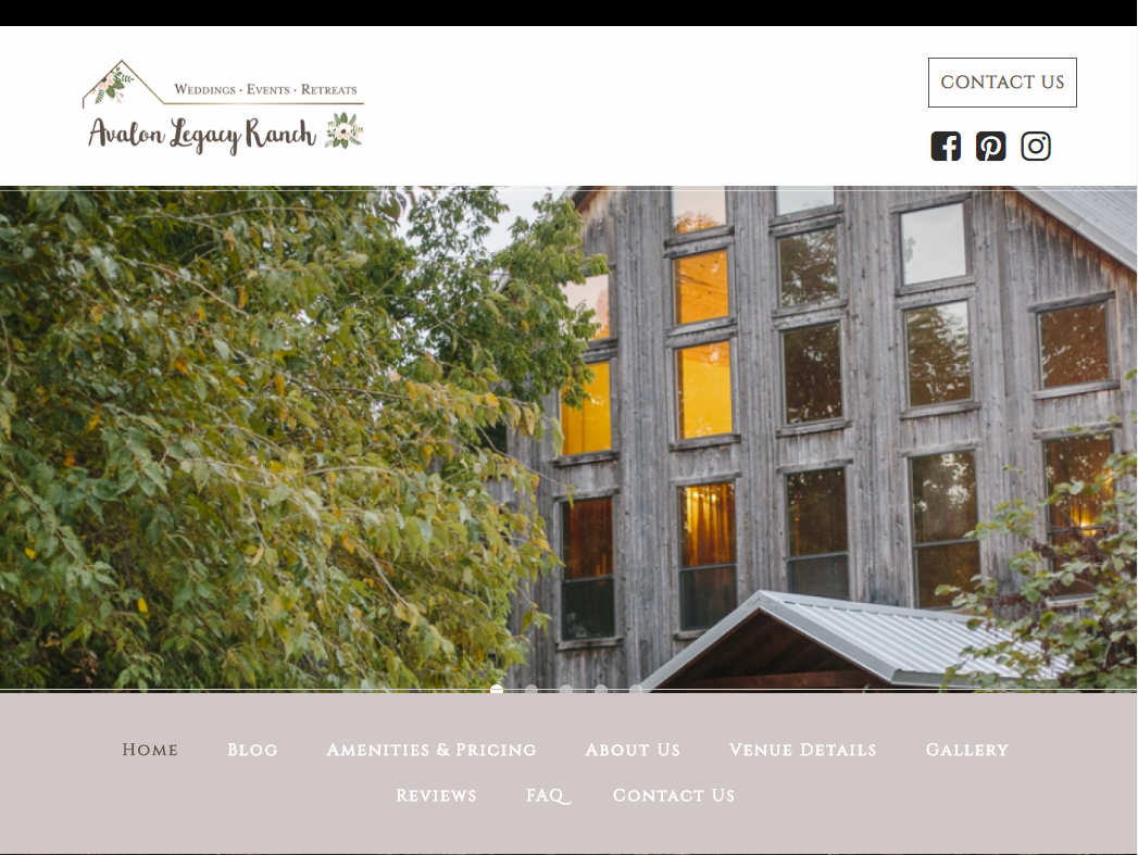
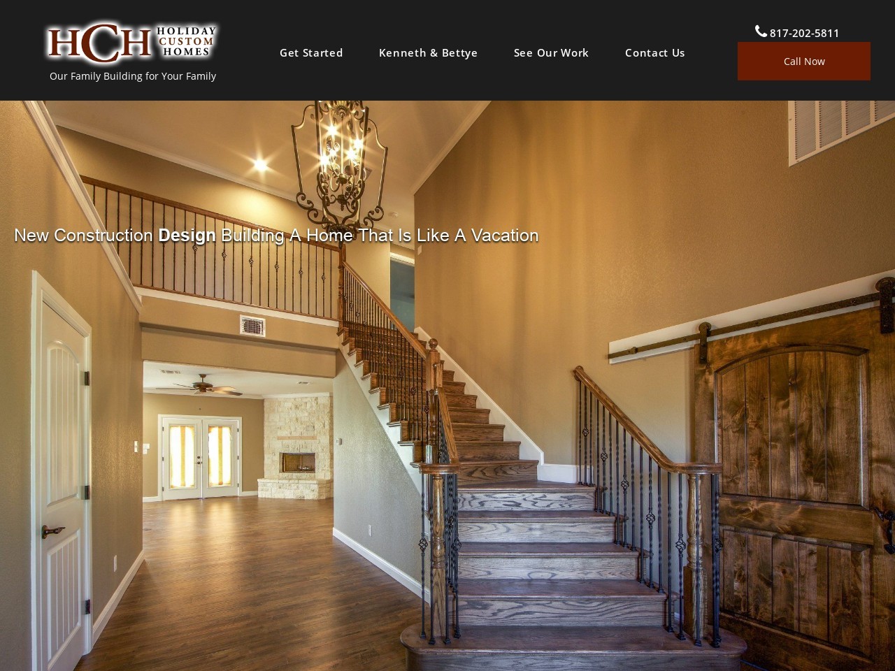
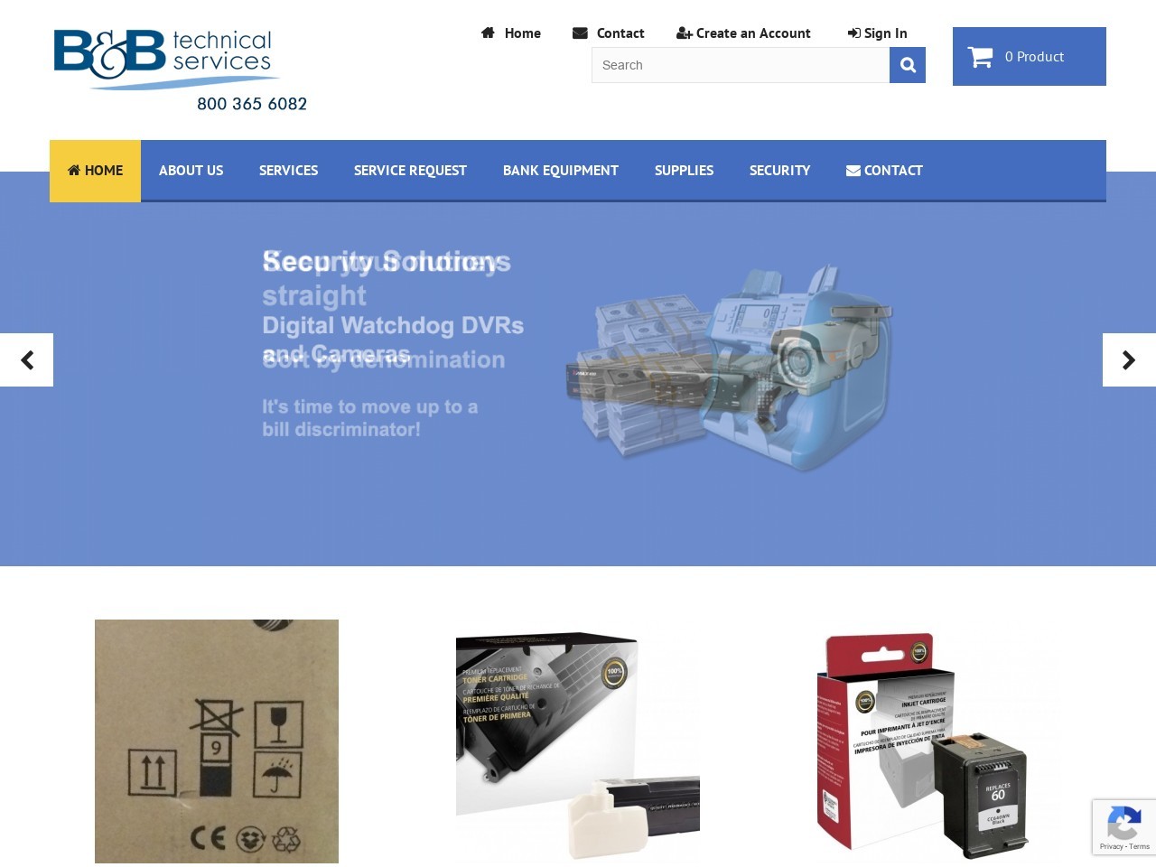
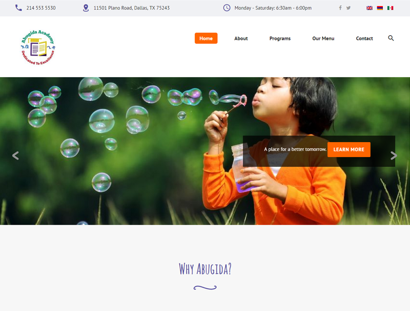
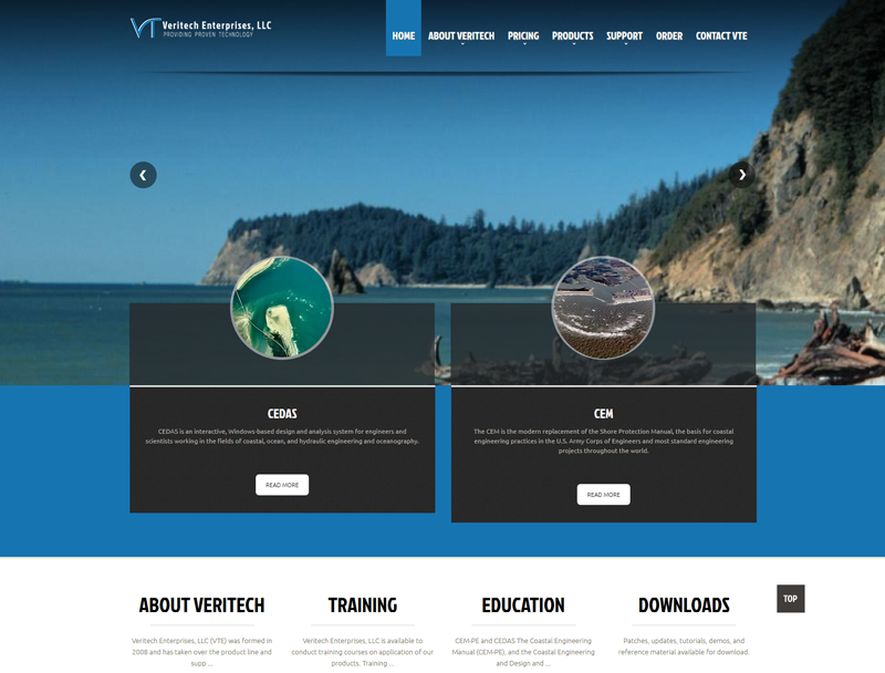
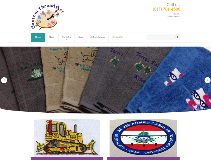
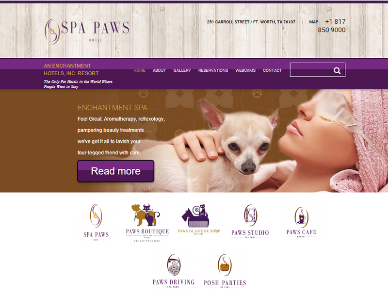
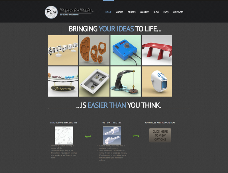
YWG Clients who use a Responsive Web Design
Filter Portfolio
All ()
3D Modeling ()
Agricultural ()
Animals and Animal Care ()
Apparel ()
Associations ()
Automotive ()
Banks and Banking ()
Builders ()
Business ()
Business to Business ()
Business Valuation and Brokering ()
Chamber of Commerce ()
Charitable Organization ()
Cleaning and Janitorial ()
Clothing ()
Club or Group ()
Commercial Services ()
Community Focus ()
Construction ()
Consultant ()
Continuing Education ()
Counseling Services ()
Courier Service ()
Custom Embroidery ()
Dating ()
Document Management ()
Education ()
Electrical Services ()
Engineering ()
Entertainment ()
Event Needs ()
Fashion ()
Financial ()
Floral ()
Food and Dining ()
For Kids ()
Gardening ()
Handy Man ()
Holistic Services ()
Home Improvement ()
Hotels and Hospitality ()
HR and Manpower ()
Hunting and Fishing ()
HVAC ()
Industrial ()
Industry Specific Group ()
Investment and Investing ()
Landscaping ()
Legal ()
Lighting ()
Manufacturer ()
Marblecrafting ()
Medical ()
Nutrition ()
Opinion ()
Outdoor ()
Pets and Pet Stores ()
Photo and Video ()
Printing ()
Public Relations ()
Real Estate ()
Residential Services ()
Restaurant ()
Retail ()
School ()
Screen Printing ()
SEO Specific ()
Shopping ()
Storage ()
Teachers ()
Technology ()
Transportation ()
Wedding ()
Wholesaler ()


Make Us Your-Web-Guys Today
 Step 1: Tell us about your business
My company...


